Constantly Improving U/X And Conversions
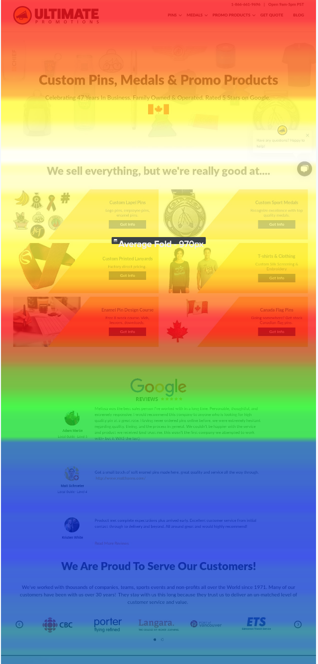
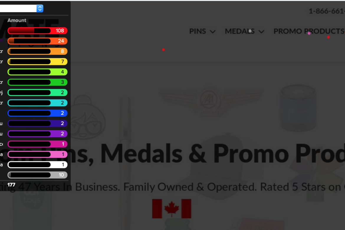
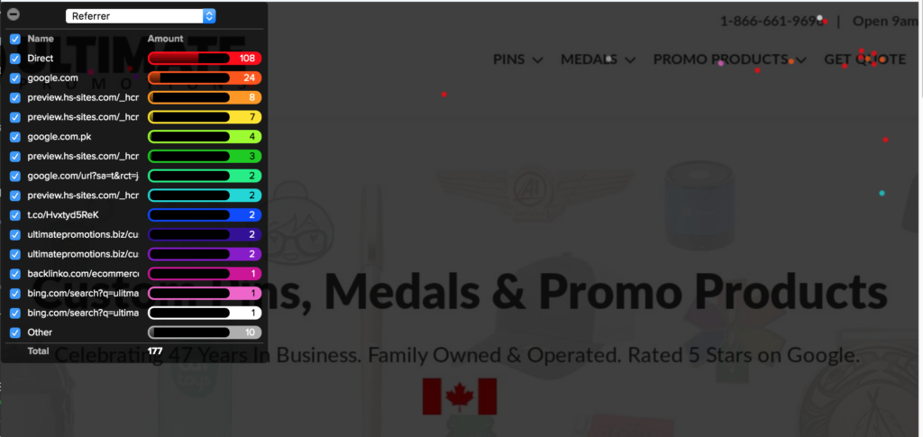
Using a heatmap can be an incredibly valuable tool for making U/X decisions. (U/X= user experience) You can test out multiple page layouts and tweak image sizes, product layout and more. You can even tell what menus people click on more than others. Check this out! Most of these users want to cut to the chase and get a quote. I must be doing something right! Hint: Since I launched this page in October 2018, I’ve re-done it 3x.
Two months ago, my home page had a high bounce rate. [that’s when people arrive and leave before 10s] I ran some heatmap tests and saw my product carousel wasn’t enticing people to click. The button was too far down the page.
Two weeks ago, I set up a more visual, block style product showcase instead. My bounce rate was 85%. It’s now 58%!
This recent heat map shows me people are moving through the site the way I want them too. I keep these tests running all the time and optimize my pages often.
Here is where you get this piece of fancy schmancy goodness. https://www.crazyegg.com/
The red area indicates almost 100% viewed. As the colour slides down the coolness scale, the users who are viewing that content has dropped.